Coco Chanel famously said, “The best color in the whole world is the one that looks good on you.”
I might add, or on your walls! Color is beauty made manifest and has transformational power, whatever product it is attached to. The way we express ourselves with color and what it means is an issue left mostly to philosophers, scientists, artists, and sages, but the effect it has is universal: color changes everything.
One of the most popular videos I did was on the color of the year for 2021, so I’m excited to tell you what 2022’s colors are, and how we can interpret them and apply them to our lives.
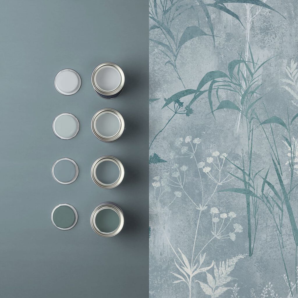
I’m going to remind you here that there is no absolute. This is just about the love of design and color so if you have these colors, great. If not, no pressure. Let’s figure out what they are. For 2022, we’ve got a soft green palette. That’s not a surprise. The natural, earthy colors that were prevalent in 2021 are now being carried through to 2022. But there are still some surprises!
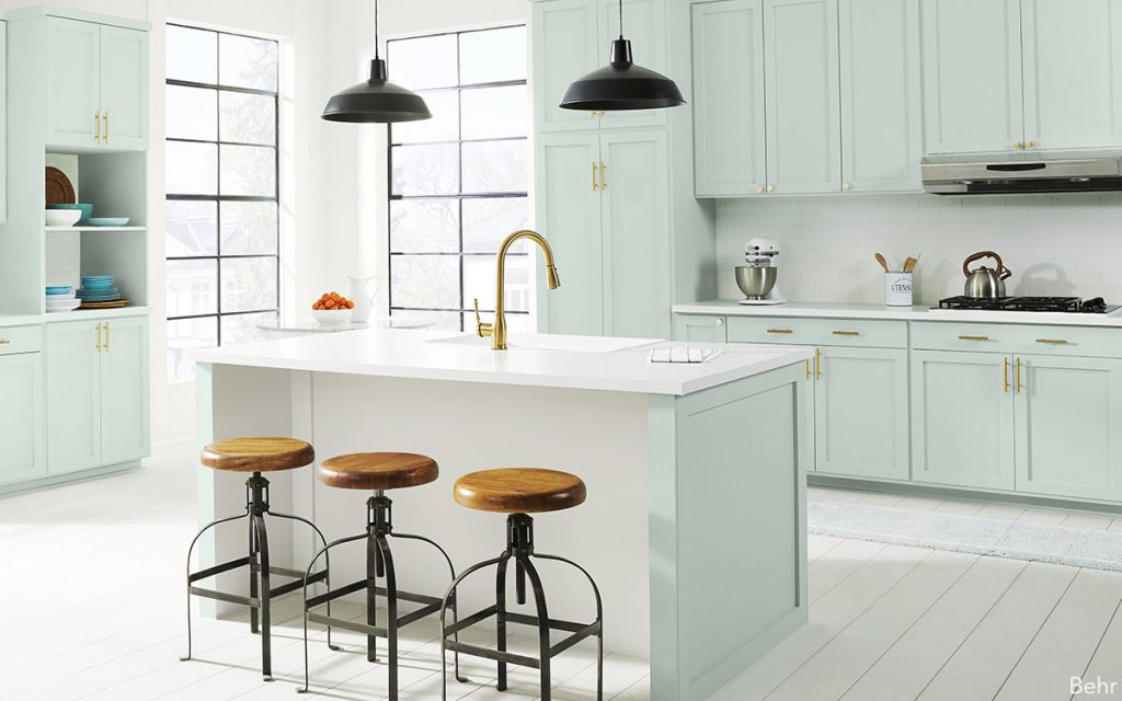
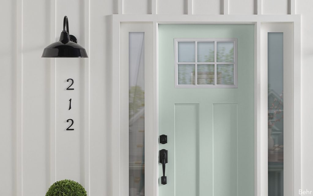
We’re going to start with my absolute favorite color, which is green. I don’t know if you know this about me but I love green. So much so that I use it whenever I can and wherever I can. We’re going to start with Breezeway by Behr. I love minty greens and Breezeway is a fresh, light mint green, almost white, and I love it for kitchen cabinets. I think, however, I’d love it more in a powder room, a good place to introduce green.
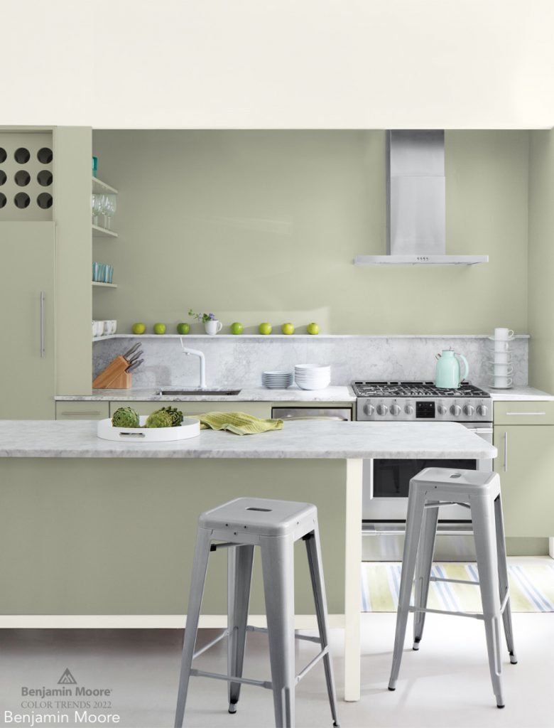
The next green I want to highlight is by Benjamin Moore and it’s called October Mist. It’s less of a mint and more of a warm green with earthy elements along with the hues of sage.
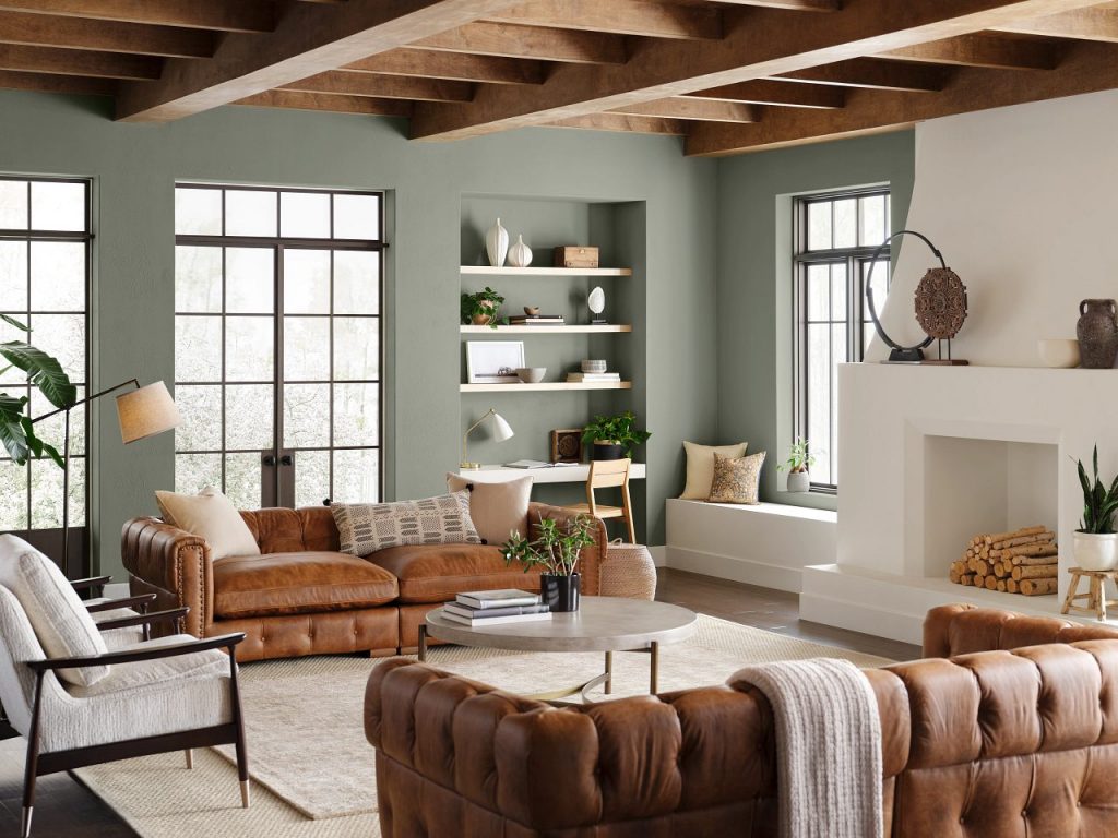
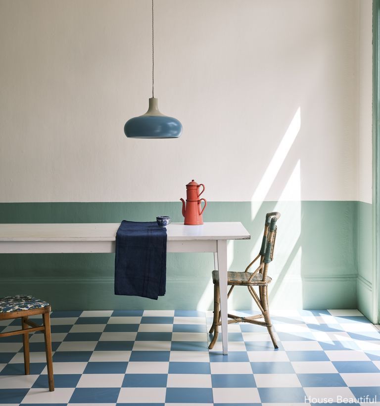
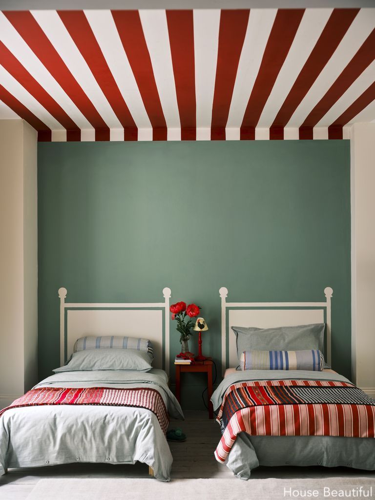
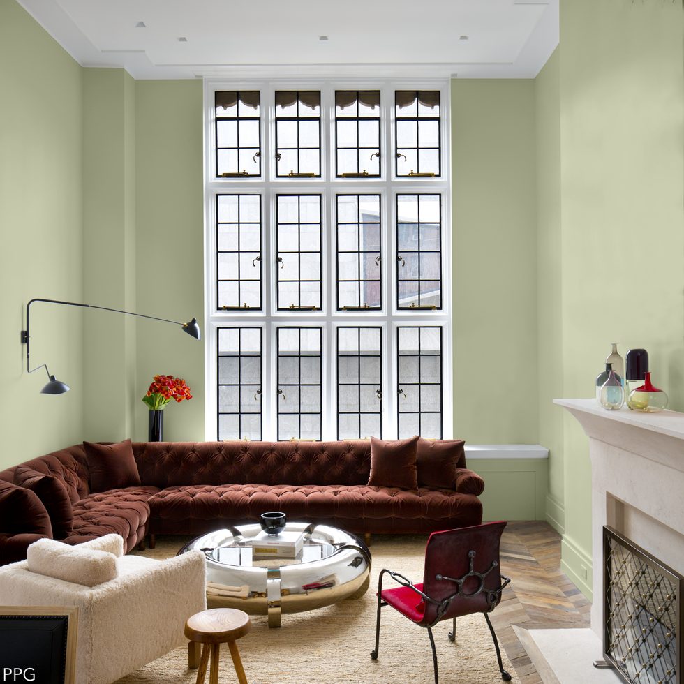 Olive Sprig from PPG Paints is great and what I love about it is that it’s a color that lives on your walls and inhabits your space. And just look how gorgeous this rust-colored sectional looks sitting against it.
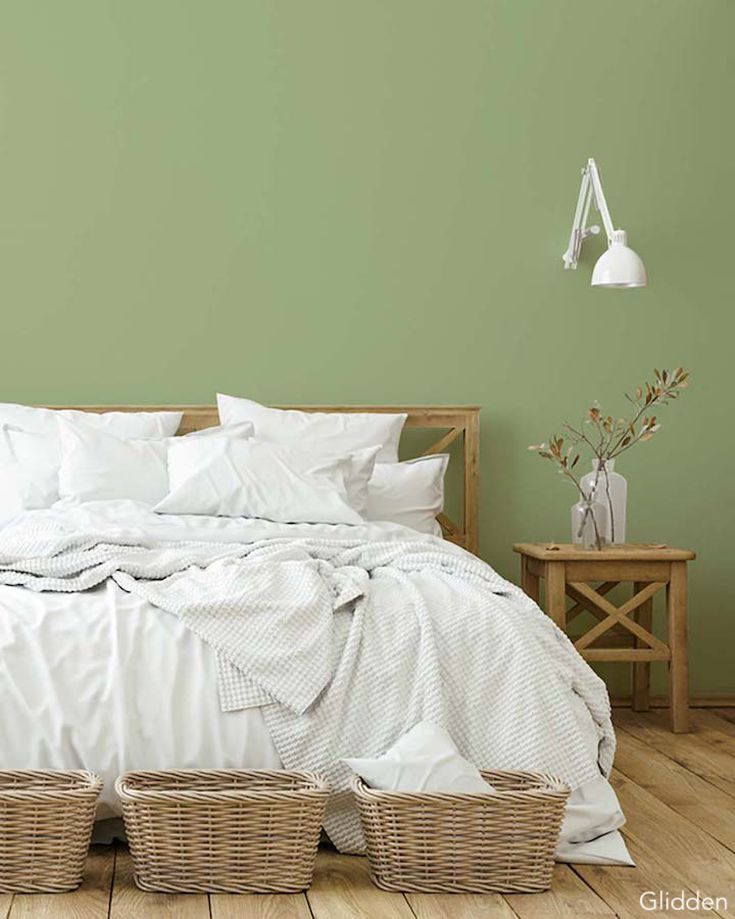
Guacamole by Glidden is also a wonderful color. It has a little more depth to it. I don’t know if I like it as much as Olive Sprig but I have to say, this is also a very fun color and completely transforms the mood and look of your space.
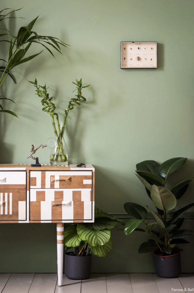
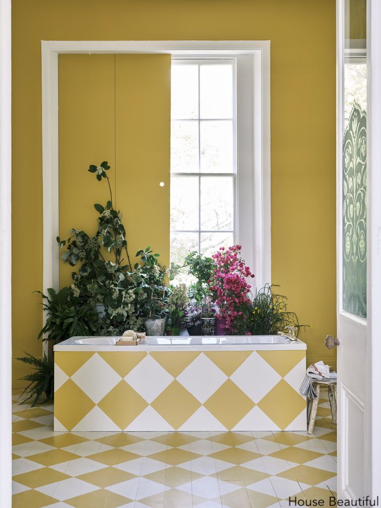
My excitement has not ended with these colors because I have found my all-time favorite green and it’s called Breakfast Room Green by Farrow & Ball. It speaks wonders. It’s so neutral that it will go with any combination of colors but see how well it goes with this earthy, ceramic terracotta shade.
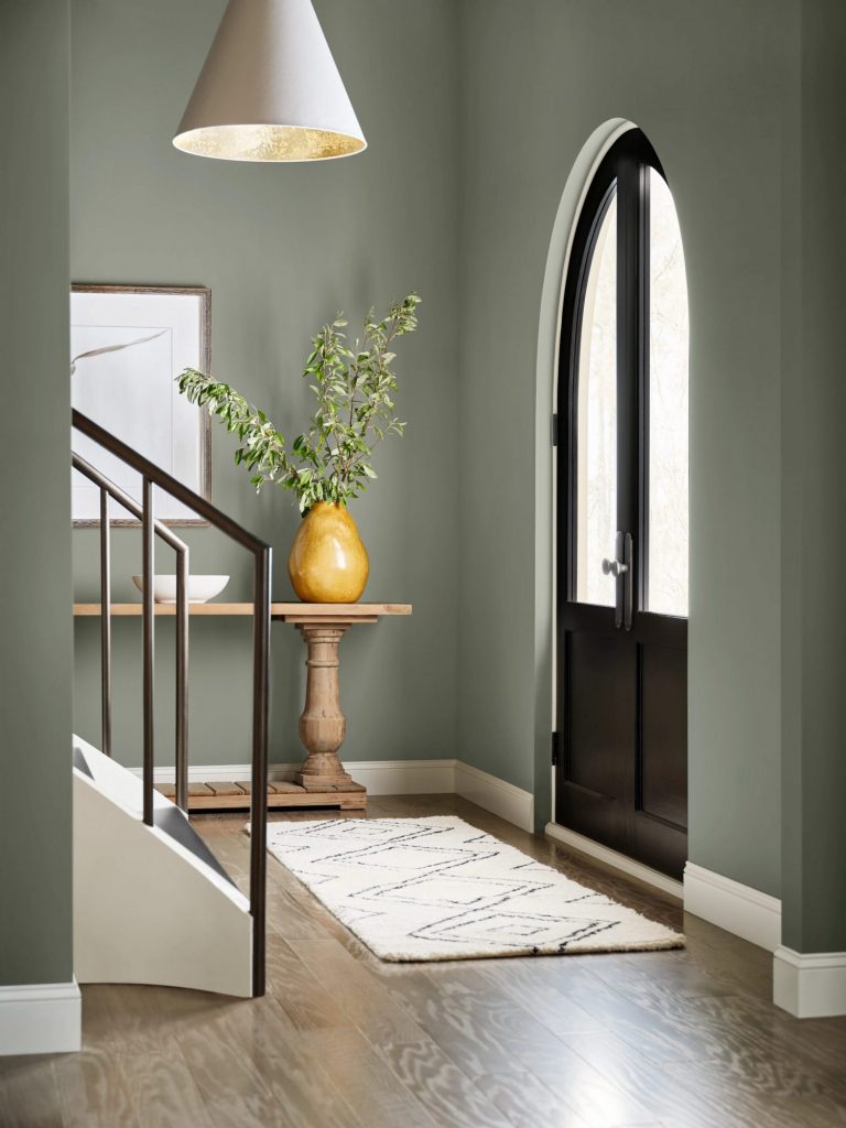
Don’t be afraid of color this year. I know everything’s been white and neutral, and I do love white, I have to say. But why not bring in a little warmth with Evergreen Fog by Sherwin-Williams?
This is a great color for an entrance because it can take a lot of light. If you’re lucky enough to have a front entrance with a glass front door or some windows, having this color there really enhances it.
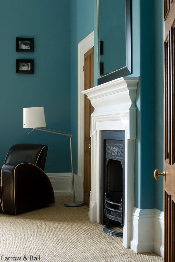
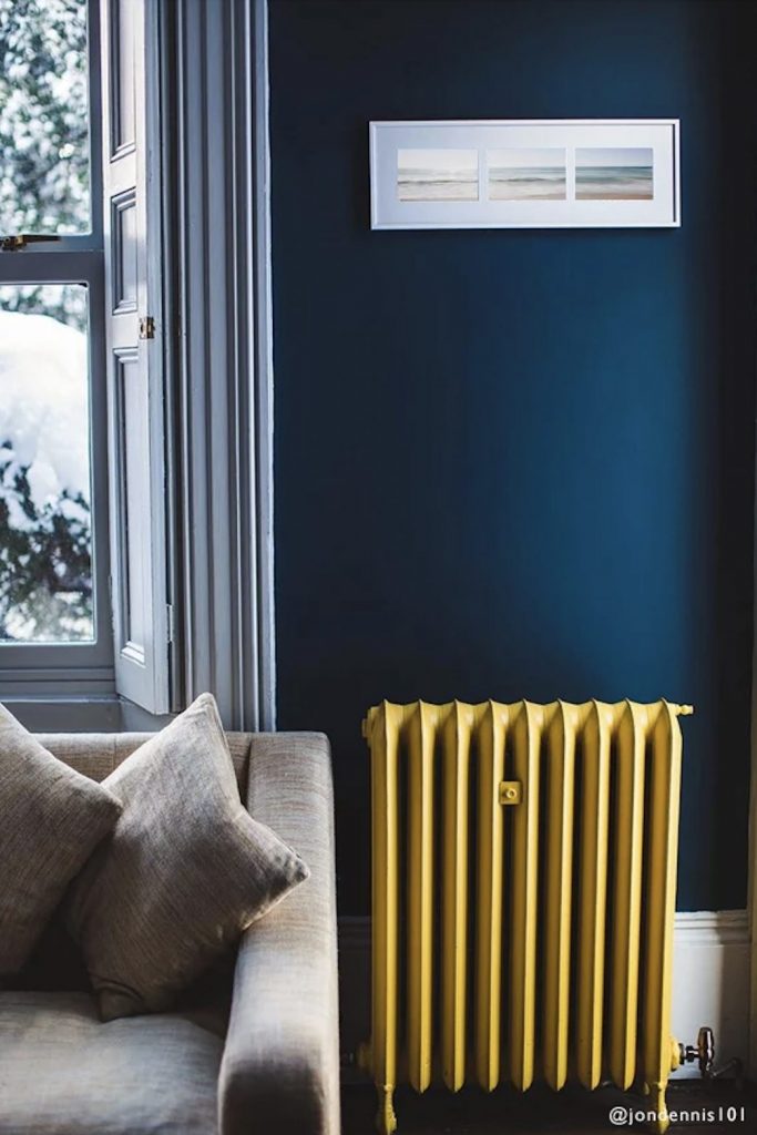
One of the great surprises of this year that I was shocked about – and I thought I knew what was happening – was Farrow & Ball’s Stone Blue. Why am I surprised that blue is in the picture? Well, because we were super earthy and blue to me isn’t all that earthy. But is it? Look at Stone Blue. This color is really magnetic. It’s bright and therefore not for the faint of heart, but what’s great is that it pops against white. If you have a white fireplace, molding or trim and you use Stone Blue, you’re sure to get a great reaction.
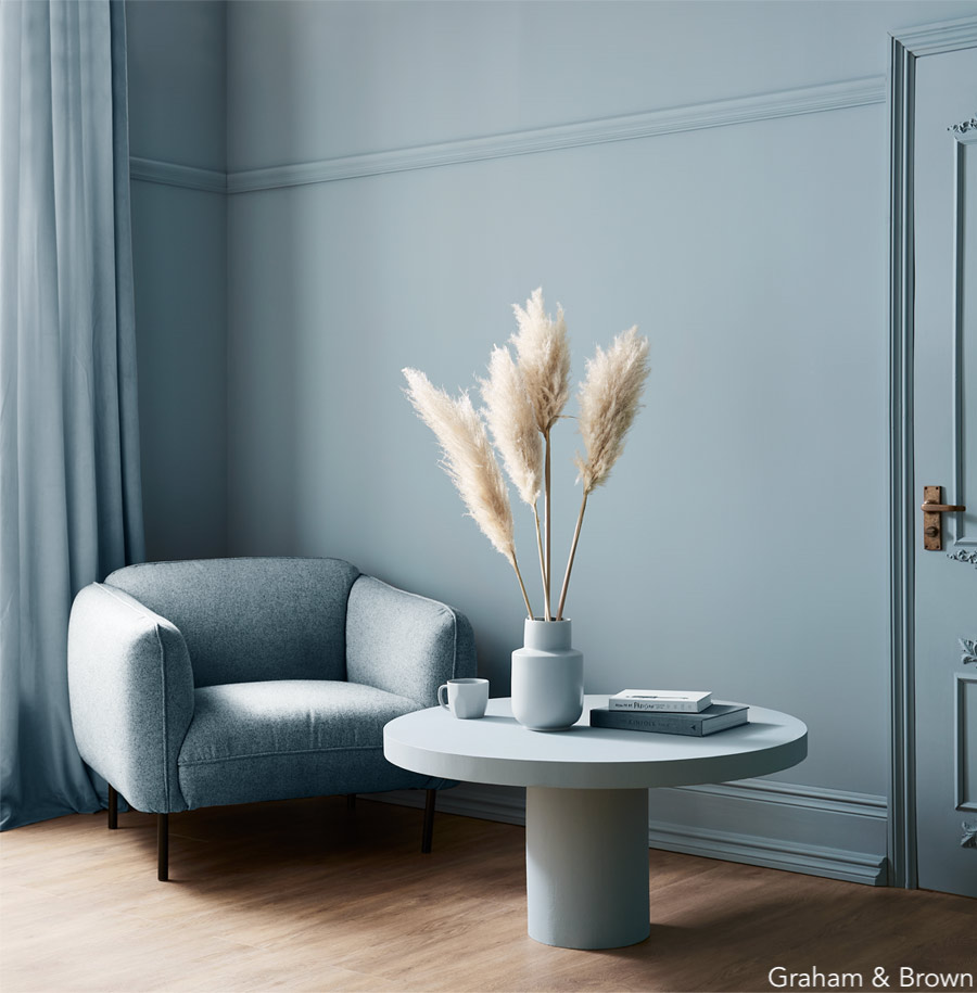
My next favorite blue is Breathe. It is such a beautiful color. I thought I didn’t like blue until I saw this application. It’s the powder blue that’s so chic. In fact, I’d like to do an entire room in this color. The walls, the moldings, the chair, everything, with a pop of natural oak.
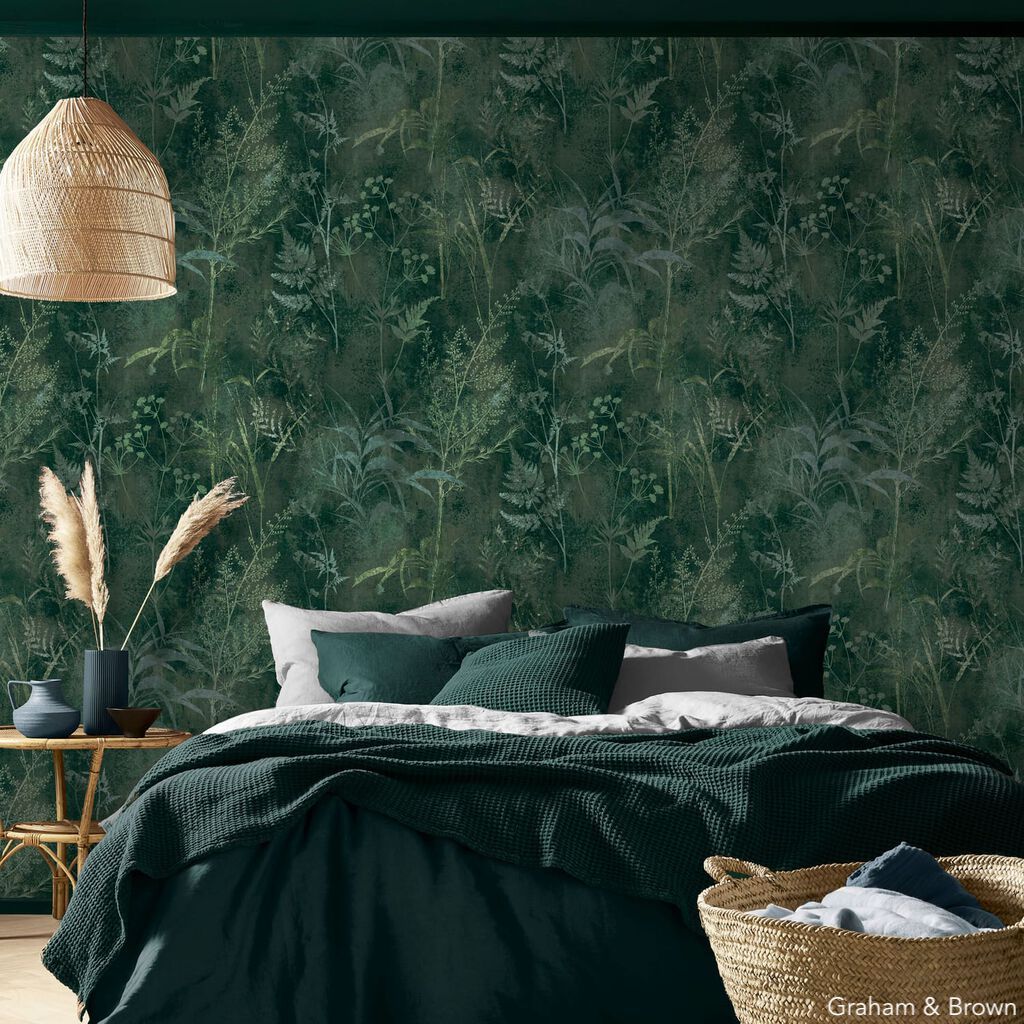
Graham & Brown released their wallpaper of the year which I wanted to point out because it looks very Chinoiserie without the price tag which, as you know always appeals to me since I love to get a good deal. So this is a good one if you’re at a loss as to what wallpaper to use. It’s a no-brainer.
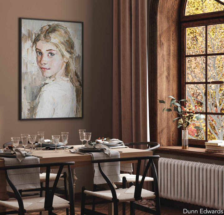
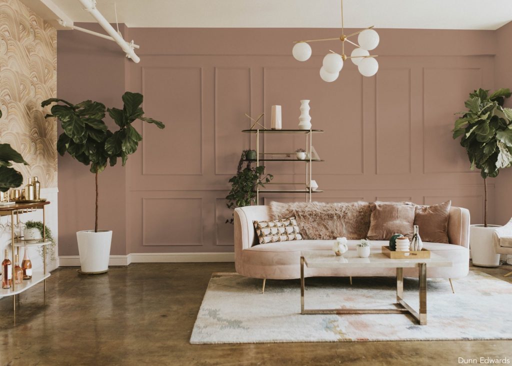
I was super excited about this next color and think I’m just going to have to paint something in Art and Craft by Dunn Edwards. This is one of my favorite colors, and I know it sounds like everything is my favorite color, but I have a penchant for that dirty blush. It’s a great neutral color. It feels very earth-like and chalky and I definitely will be using it.
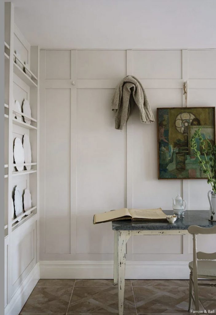
You know I love white – and not just any white. I tried 7,000 whites before settling on Simply White by Benjamin Moore. But this year I found a white I’m interested in. I haven’t tried it yet but I think it’s going to be a good one. It’s called Schoolhouse White by Farrow & Ball and what I love about it is you can use it with Simply White and other whites. If you put white china against it, it actually pops so it’s very versatile.
Another color I like is called Babouche, also by Farrow & Ball, which is a dirty canary yellow. I would like to see this applied to a ceiling. But I don’t necessarily want to see it on the walls.
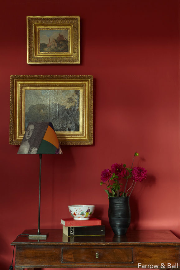
If you’re feeling a sultry vibe this season, Farrow & Ball’s Incarnadine will show you the way. Rouge, with a little bit of sexy in it.
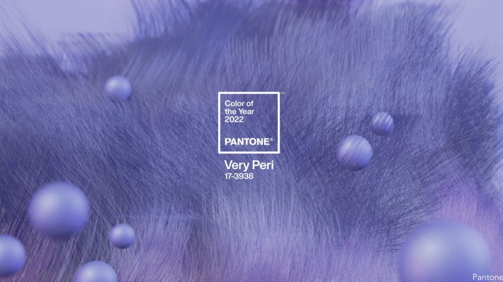
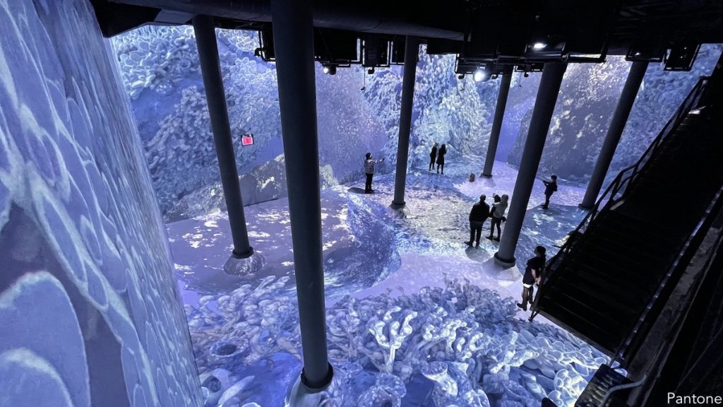
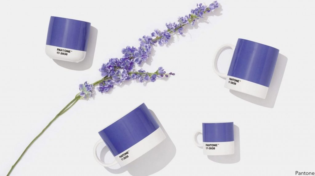
The big surprise that I left for the end is the Pantone Color of the Year. It’s called Very Peri and it’s confident and carefree. It’s a lot of things actually, including interesting. I had no clue purple was going to come anywhere near us. Purple for me is the farthest thing from earthy, but it is very fun. This is the first time in history that Pantone, which sets the color for everything from food to fashion, has created a color from scratch instead of mixing already existing shades. And what’s interesting about Very Peri is that it’s the antithesis, the polar opposite of the neutral colors. Where did Pantone get the idea for their 2022 Color of the Year? From the blue glow of the digital world’s devices, which are changing almost everything we know!
Happy New Year!